IEEE Transations on Visualization and Computer Graphics, 2025.
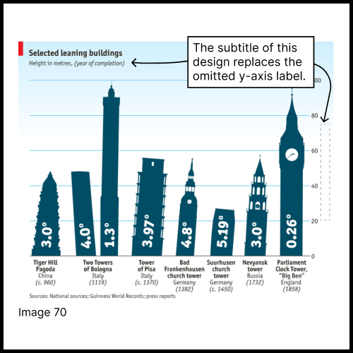
Text is an integral but understudied component of visualization design. Although recent studies have examined how text elements (e.g., titles and annotations) influence comprehension, preferences, and predictions, many questions remain about textual design and use in practice. This paper introduces a framework for understanding text functions in information visualizations, building on and filling gaps in prior classifications and taxonomies. Through an analysis of 120 real-world visualizations and 804 text elements, we identified ten distinct text functions, ranging from identifying data mappings to presenting valenced subtext. We further identify patterns in text usage and conduct a factor analysis, revealing four overarching text-informed design strategies: Attribution and Variables, Annotation-Centric Design, Visual Embellishments, and Narrative Framing. In addition to these factors, we explore features of title rhetoric and text multifunctionality, while also uncovering previously unexamined text functions, such as text replacing visual elements. Our findings highlight the flexibility of text, demonstrating how different text elements in a given design can combine to communicate, synthesize, and frame visual information. This framework adds important nuance and detail to existing frameworks that analyze the diverse roles of text in visualization. OSF materials can be found at https://osf.io/swqfc/overview.
IEEE Transations on Visualization and Computer Graphics, 2025.
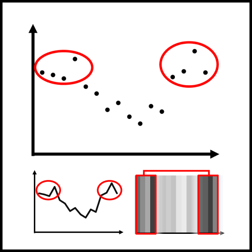
A growing body of work on visualization affordances highlights how specific design choices shape reader takeaways from information visualizations. However, mapping the relationship between design choices and reader conclusions often requires labor-intensive crowdsourced studies, generating large corpora of free-response text for analysis. To address this challenge, we explored alternative scalable research methodologies to assess chart affordances. We test four elicitation methods from human-subject studies: free response, visualization ranking, conclusion ranking, and salience rating, and compare their effectiveness in eliciting reader interpretations of line charts, dot plots, and heatmaps. Overall, we find that while no method fully replicates affordances observed in free-response conclusions, combinations of ranking and rating methods can serve as an effective proxy at a broad scale. The two ranking methodologies were influenced by participant bias towards certain chart types and the comparison of suggested conclusions. Rating conclusion salience could not capture the specific variations between chart types observed in the other methods. To supplement this work, we present a case study with GPT-4o, exploring the use of large language models (LLMs) to elicit human-like chart interpretations. This aligns with recent academic interest in leveraging LLMs as proxies for human participants to improve data collection and analysis efficiency. GPT-4o performed best as a human proxy for the salience rating methodology but suffered from severe constraints in other areas. Overall, the discrepancies in affordances we found between various elicitation methodologies, including GPT-4o, highlight the importance of intentionally selecting and combining methods and evaluating trade-offs. Materials for this work can be found at https://osf.io/ynzhm/overview.
Workshop on Human-Centered Evaluation and Auditing of Language Models at CHI Conference on Human Factors in Computing Systems, 2025.
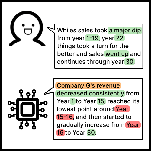
Identifying the relationship between data visualization design and human interpretation often requires time-consuming crowdsourced studies that generate large text corpora. Given recent academic exploration into the use of large language models (LLMs) as proxies for human study participants, we anticipate interest within the visualization community on LLM predictions as proxies for human chart interpretation. We present a case study on the effectiveness of OpenAI's GPT-4o model to predict human takeaways from charts. Using the lens of visualization affordances, we conduct a factor analysis on human chart takeaways, identifying five affordance factors. We then compare the affordances of different chart types between human readers and GPT-4o, revealing discrepancies in takeaway accuracy, semantic diversity, response length, and alignment with human interpretations. We caution against using LLMs as human proxies in empirical studies and outline critical directions for future research on LLM predictions of human reasoning with data visualizations.
IEEE Transations on Visualization and Computer Graphics, 2024.
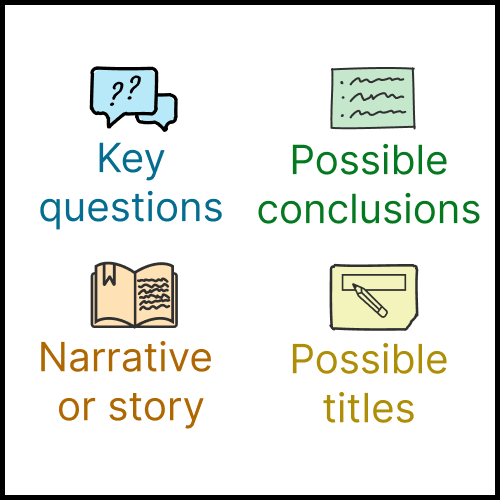
Written language is a useful tool for non-visual creative activities like composing essays and planning searches. This paper investigates the integration of written language into the visualization design process. We create the idea of a 'writing rudder,' which acts as a guiding force or strategy for the designer. Via an interview study of 24 working visualization designers, we first established that only a minority of participants systematically use writing to aid in design. A second study with 15 visualization designers examined four different variants of written rudders: asking questions, stating conclusions, composing a narrative, and writing titles. Overall, participants had a positive reaction; designers recognized the benefits of explicitly writing down components of the design and indicated that they would use this approach in future design work. More specifically, two approaches — writing questions and writing conclusions/takeaways — were seen as beneficial across the design process, while writing narratives showed promise mainly for the creation stage. Although concerns around potential bias during data exploration were raised, participants also discussed strategies to mitigate such concerns. This paper contributes to a deeper understanding of the interplay between language and visualization, and proposes a straightforward, lightweight addition to the visualization design process. OSF materials can be found at https://osf.io/yjsnh/overview.
Workshop on Uncertainty Visualization: Applications, Techniques, Software, and Decision Frameworks in conjunction with IEEE VIS Conference, 2024.
Understanding and communicating data uncertainty is crucial for informed decision-making across various domains, including finance, healthcare, and public policy. This study investigates the impact of gender and acoustic variables on decision-making, confidence, and trust through a crowdsourced experiment. We compared visualization-only representations of uncertainty to text-forward and speech-forward bimodal representations, including multiple synthetic voices across gender. Speech-forward representations led to an increase in risky decisions, and text-forward representations led to lower confidence. Contrary to prior work, speech-forward forecasts did not receive higher ratings of trust. Higher normalized pitch led to a slight increase in decision confidence, but other voice characteristics had minimal impact on decisions and trust. An exploratory analysis of accented speech showed consistent results with the main experiment and additionally indicated lower trust ratings for information presented in Indian and Kenyan accents. The results underscore the importance of considering acoustic and contextual factors in presentation of data uncertainty. Materials for this work can be found at https://osf.io/mdz2y/overview.
Proceedings of Eurographics Conference on Visualization in Computer Graphics Forum, 2024.
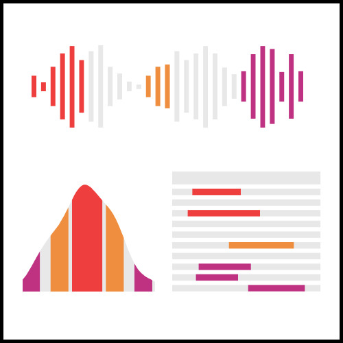
Interpreting uncertain data can be difficult, particularly if the data presentation is complex. We investigate the efficacy of different modalities for representing data and how to combine the strengths of each modality to facilitate the communication of data uncertainty. We implemented two multimodal prototypes to explore the design space of integrating speech, text, and visualization elements. A preliminary evaluation with 20 participants from academic and industry communities demonstrates that there exists no one-size-fits-all approach for uncertainty communication strategies; rather, the effectiveness of conveying uncertain data is intertwined with user preferences and situational context, necessitating a more refined, multimodal strategy for future interface design. Materials for this paper can be found at https://osf.io/6g8ex/overview.
Proceedings of Eurographics Conference on Visualization in Computer Graphics Forum, 2024.
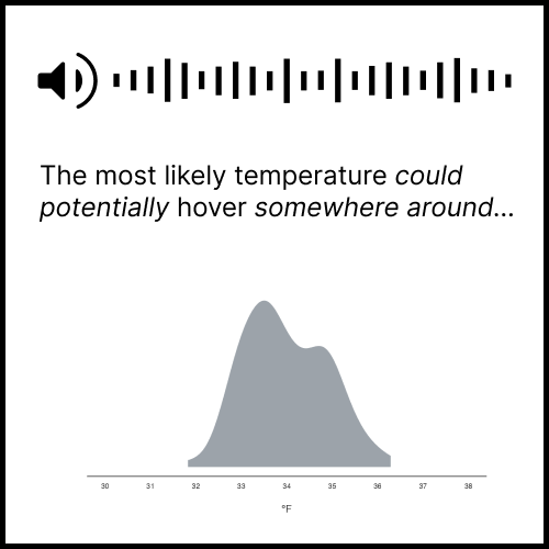
Understanding and communicating data uncertainty is crucial for making informed decisions in sectors like finance and healthcare. Previous work has explored how to express uncertainty in various modes. For example, uncertainty can be expressed visually with quantile dot plots or linguistically with hedge words and prosody. Our research aims to systematically explore how variations within each mode contribute to communicating uncertainty to the user; this allows us to better understand each mode's affordances and limitations. We completed an exploration of the uncertainty design space based on pilot studies and ran two crowdsourced experiments examining how speech, text, and visualization modes and variants within them impact decision-making with uncertain data. Visualization and text were most effective for rational decision-making, though text resulted in lower confidence. Speech garnered the highest trust despite sometimes leading to risky decisions. Results from these studies indicate meaningful trade-offs among modes of information and encourage exploration of multimodal data representations. Materials for this paper can be found at https://osf.io/6g8ex/overview.

IEEE Transations on Visualization and Computer Graphics, 2024.
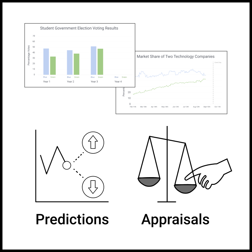
This paper investigates the role of text in visualizations, specifically the impact of text position, semantic content, and biased wording. Two empirical studies were conducted based on two tasks (predicting data trends and appraising bias) using two visualization types (bar and line charts). While the addition of text had a minimal effect on how people perceive data trends, there was a significant impact on how biased they perceive the authors to be. This finding revealed a relationship between the degree of bias in textual information and the perception of the authors' bias. Exploratory analyses support an interaction between a person's prediction and the degree of bias they perceived. This paper also develops a crowdsourced method for creating chart annotations that range from neutral to highly biased. This research highlights the need for designers to mitigate potential polarization of readers' opinions based on how authors' ideas are expressed. Materials for this paper can be found at https://osf.io/4bysj/overview.
IEEE Transations on Visualization and Computer Graphics, 2023.
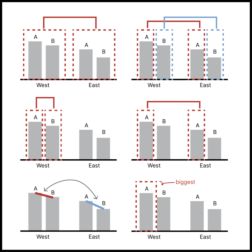
Reading a visualization is like reading a paragraph. Each sentence is a comparison: the mean of these is higher than those; this difference is smaller than that. What determines which comparisons are made first? The viewer's goals and expertise matter, but the way that values are visually grouped together within the chart also impacts those comparisons. We create a visual comparison taxonomy that allows us to develop and test a sequence of hypotheses about which comparisons people are more likely to make when reading a visualization. We find that people tend to compare two groups before comparing two individual bars and that second-order comparisons are rare. Visual cues like spatial proximity and color can influence which elements are grouped together and selected for comparison, with spatial proximity being a stronger grouping cue. Interestingly, once the viewer grouped together and compared a set of bars, regardless of whether the group is formed by spatial proximity or color similarity, they no longer consider other possible groupings in their comparisons.

IEEE Transations on Visualization and Computer Graphics, 2022.
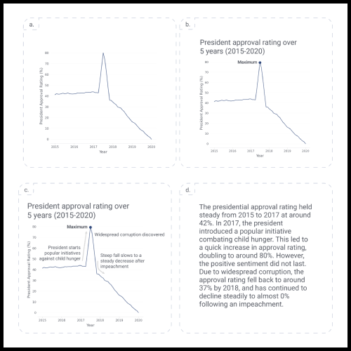
While visualizations are an effective way to represent insights about information, they rarely stand alone. When designing a visualization, text is often added to provide additional context and guidance for the reader. However, there is little experimental evidence to guide designers as to what is the right amount of text to show within a chart, what its qualitative properties should be, and where it should be placed. Prior work also shows variation in personal preferences for charts versus textual representations. In this paper, we explore several research questions about the relative value of textual components of visualizations. We found that participants preferred the charts with the largest number of textual annotations over charts with fewer annotations or text alone. We also found effects of semantic content. For instance, the text that describes statistical or relational components of a chart leads to more takeaways of a similar nature than text describing elemental or encoded components. Finally, we found different effects for the semantic levels based on the placement of the text on the chart; some kinds of information are best placed in the title, while others should be placed closer to the data. These results have important implications for chart design guidelines and future work pertaining to the combination of text and charts. Materials for this paper can be found at https://osf.io/vz976/overview.
Workshop on NLVIZ: Exploring Research Opportunities for Natural Language, Text, and Data Visualization in conjunction with IEEE VIS Conference, 2022.
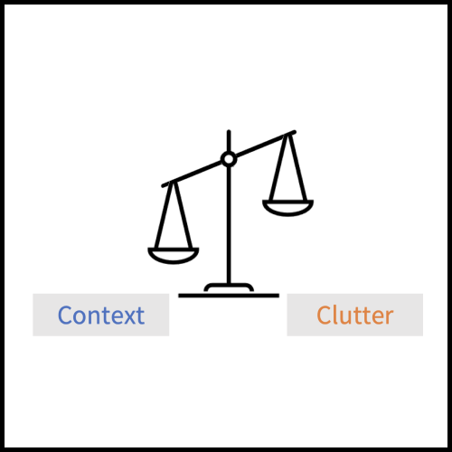
Given a choice between charts with minimal and those with copious textual annotations, participants in a study (Stokes et al., 2022) tended to prefer the charts with more text. This paper examines the qualitative responses of the participants' preferences for various stimuli integrating charts and text, including a text-only variant. A thematic analysis of these responses resulted in three main findings. First, readers commented most frequently on the presence or lack of context or detail; they preferred to be informed, even at the cost of simplicity. Second, readers discussed the story-like component of the text-only variant, making little mention of narrative in relation to the chart variants. Finally, readers showed suspicion around possible misleading elements of the chart or text. These themes support findings from previous work on annotations, captions, and alternative text and raise further questions in the study of the combination of text and visual communication. Materials for this paper can be found at https://osf.io/nwtsf/overview
IEEE Transations on Visualization and Computer Graphics, 2022.
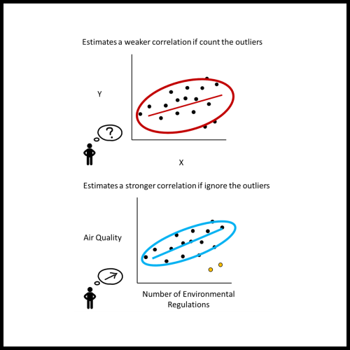
When an analyst or scientist has a belief about how the world works, their thinking can be biased in favor of that belief. Therefore, one bedrock principle of science is to minimize that bias by testing the predictions of one's belief against objective data. Through two crowdsourced experiments, we demonstrate that supposedly objective assessments of the strength of a correlational relationship can be influenced by how strongly a viewer believes in the existence of that relationship. Participants viewed in scatterplots depicting a relationship between variable pairs and estimated their correlations. After completing a distractor task, they also reported how strongly they believed there to be a correlation between the depicted variable pairs. In a control condition, they judged the same scatterplots labeled instead with generic 'X' and 'Y' axes. Participants estimated correlations more accurately when they viewed scatterplots labeled with generic axes compared to scatterplots labeled with meaningful variable pairs. Furthermore, when viewers believed that two variables should have a strong relationship, they overestimated correlations between those variables by around an r-value of 0.1. When they believed that the variables should be unrelated, they underestimated the correlations by around an r-value of 0.1. While data visualizations are typically thought to present objective truths to the viewer, these results suggest that existing personal beliefs can bias even objective statistical values people extract from data. Materials for this paper can be found at https://osf.io/3cnza/overview.
Workshop on NLVIZ: Exploring Research Opportunities for Natural Language, Text, and Data Visualization in conjunction with IEEE VIS Conference, 2021.
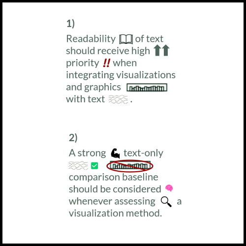
Visualization research tends to de-emphasize consideration of the textual context in which its images are placed. We argue that visualization research should consider textual representations as a primary alternative to visual options when assessing designs, and when assessing designs, equal attention should be given to the construction of the language as to the visualizations. We also call for a consideration of readability when integrating visualizations with written text. In highlighting these points, visualization research would be elevated in efficacy and demonstrate thorough accounting for viewers' needs and responses.